The Problem
YAMZ — Yet Another Metadata Zoo — is a crowdsourced repository for materials science terminology, somewhere between a glossary and a Stack Overflow. Researchers propose term definitions, other researchers upvote or downvote them, and the platform also generates an LLM-written definition alongside the human-submitted one so users can compare and vote on which they prefer. Over time, the most credible definitions rise to the top and the field converges on shared terminology.
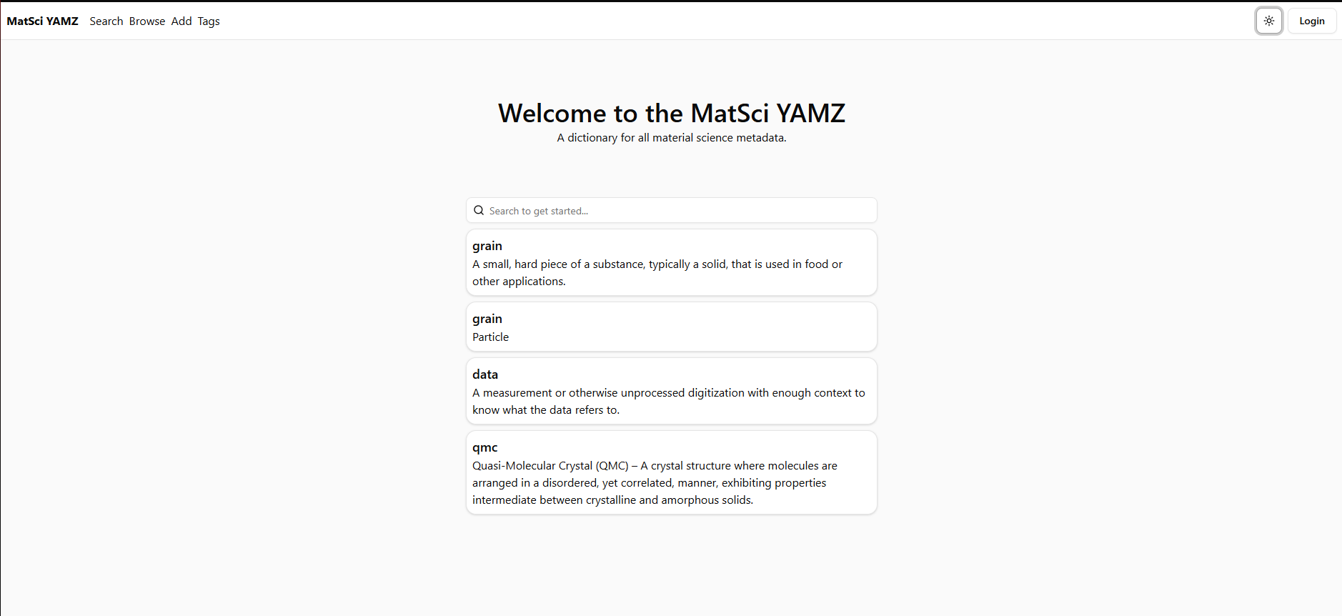
The product idea works. The interface didn't. The original site was sparse and undirected — a near-blank canvas with a search bar, a flat hyperlinked list of terms, and no explanation of what YAMZ was for or how to participate. If you already knew the platform, you could find your way around. If you didn't, the homepage told you nothing. For a platform that depends on contributions from new researchers, that's an existential UX problem: every researcher who bounces is a definition that doesn't get written and a vote that doesn't get cast.
Redesign Goals
- G1 Make the platform's purpose immediately legible to a researcher who has never seen it before.
- G2 Surface the core loop — propose a term, see the human and LLM definitions, vote — so it can be understood without instruction.
- G3 Establish a visual hierarchy and design language that respects researcher workflows and signals scientific credibility.
- G4 Ship the redesign to production in React and TypeScript so the work lives on the actual platform, not just in Figma.
Before & After
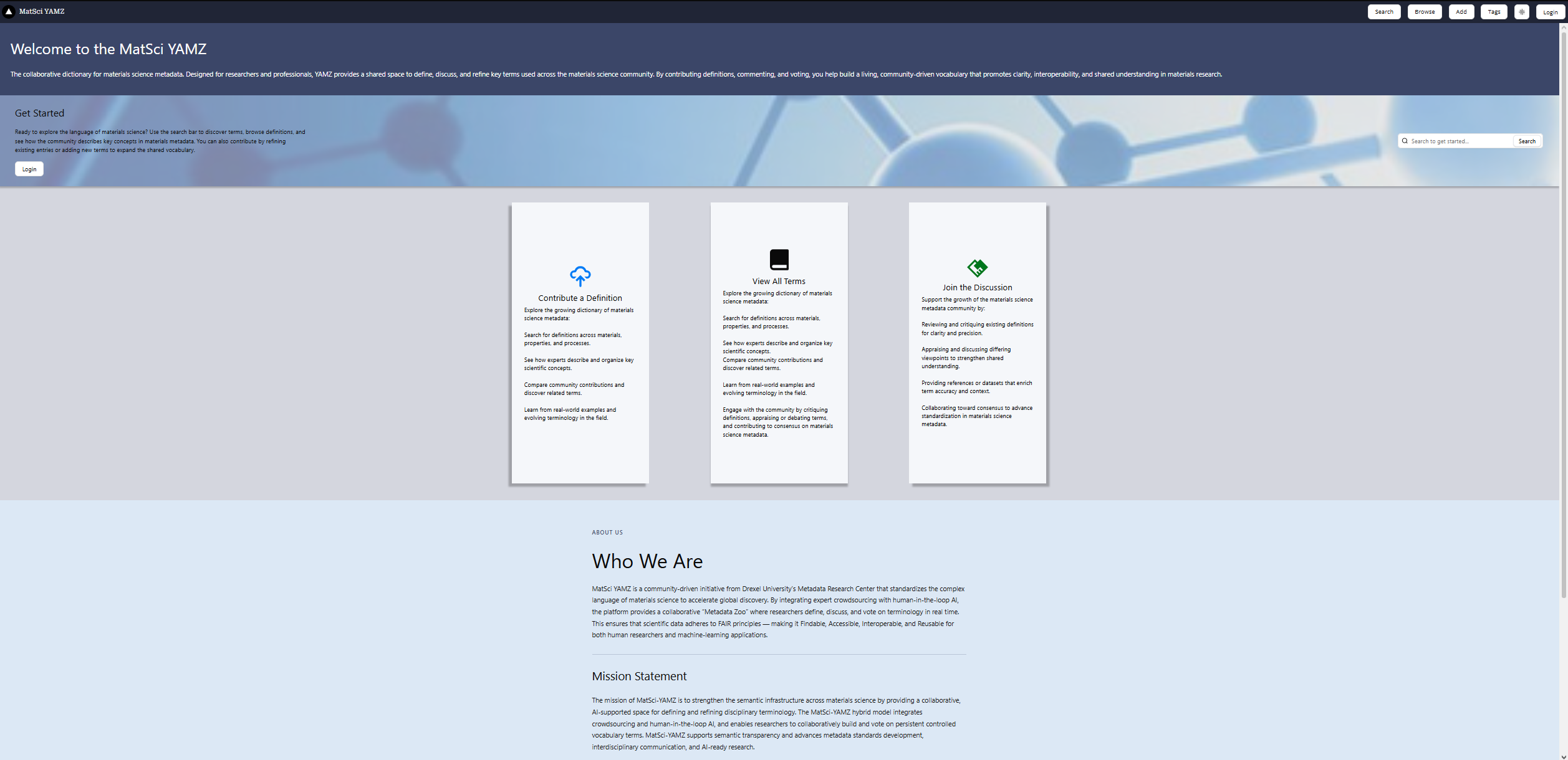
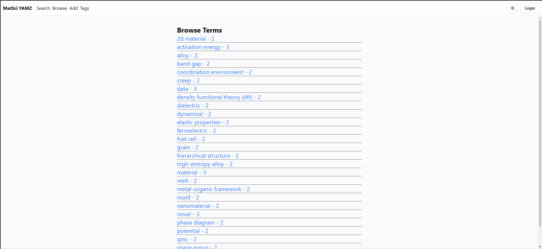
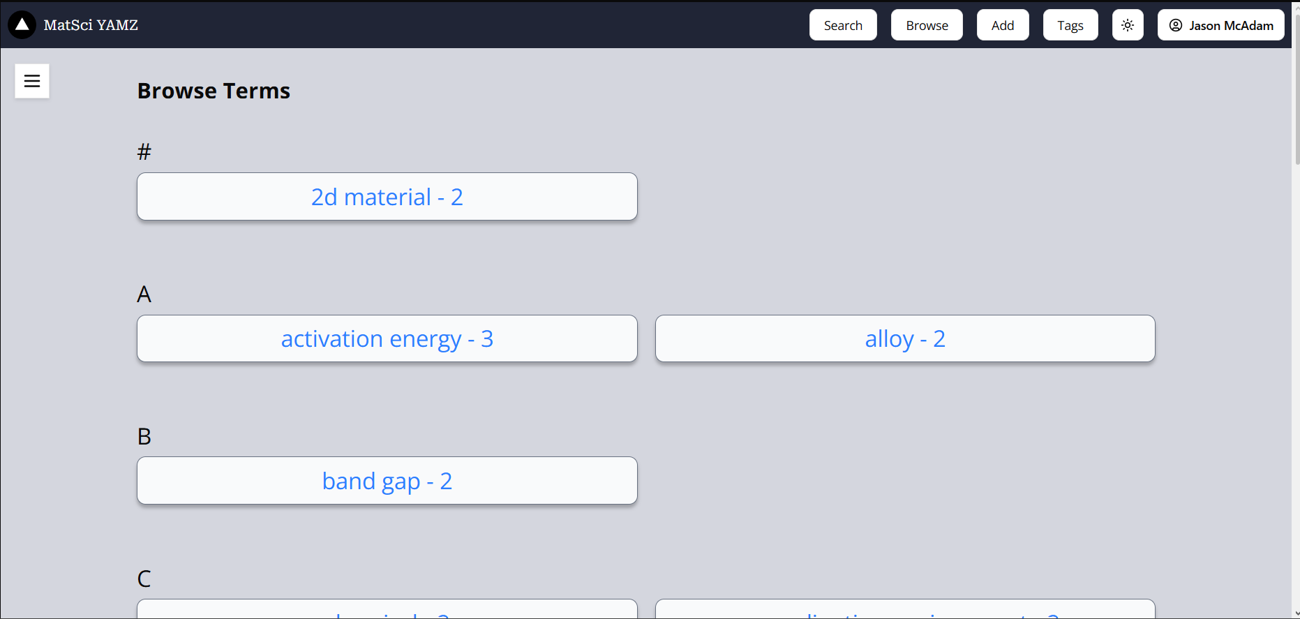
The redesign is most visible in the homepage and the browse-terms view, where the original layout left new researchers without a clear entry point and the new layout walks them into the core loop.
Testing Two Directions
Rather than commit to a single redesign direction up front, I produced two high-fidelity Figma concepts that approached the same problem from different angles, and ran a qualitative A/B test with materials science researchers — the actual user base, not a proxy sample. Participants explored each concept, wrote down what they noticed, what confused them, and which they preferred. With a small, expert sample, the goal was directional research: which design choices landed, and which didn't.
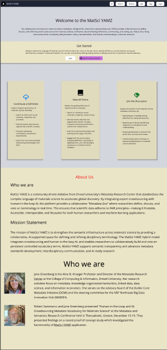
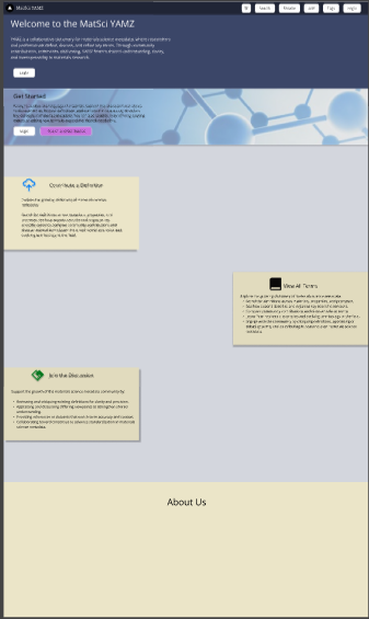
Immediate clarity
Optimized for a researcher landing on the page for the first time. Every core action is visible at once, in a conventional layout that minimizes the time between arrival and orientation.
Strengths
- Information architecture readable at first glance
- Conventional patterns reduce cognitive load
- Reliable for users with no prior context
Tradeoffs
- Visual identity reads as generic, not "scientific"
- Light palette doesn't differentiate YAMZ from any other tool
Progressive disclosure
Optimized for visual identity and engagement. Cards reveal their actions on hover; molecular imagery and a dark hero band give the platform a distinct, research-oriented look.
Strengths
- Distinctive visual identity rooted in the domain
- Encourages exploration through interaction
- Signals seriousness and scientific credibility
Tradeoffs
- Progressive disclosure costs first-time users orientation
- Staggered layout takes longer to parse than a clean grid
The strongest direction separated visual identity from information architecture. Researchers responded to Concept B's hero band, molecular imagery, and dark navigation — they signaled "this is a serious research tool." But they responded to Concept A's clean card grid for the actual feature surfaces — they signaled "here's what you can do." The shipped redesign takes Concept B's visual treatment and applies it to Concept A's information architecture, getting the identity of one and the legibility of the other.
Key Design Decisions
Five decisions shaped the redesign from feedback to ship:
→ 01 Give the homepage a job
The original homepage tried to be a workspace for users who didn't exist yet. The redesigned homepage commits to onboarding first: a clear statement of what YAMZ is, a visible entry point into the core loop, and an About section to establish credibility with researchers encountering the platform for the first time.
→ 02 Use visual identity to signal what kind of tool this is
The dark navy hero band and molecular imagery aren't decoration — they're a classification cue. Within two seconds of landing, a researcher should understand that this is a scientific tool, not a generic content platform. The visual language does that work before the copy even has a chance to.
→ 03 Restructure the browse experience around scannability
The original term list was a flat sequence of underlined links — readable, but impossible to scan. The redesigned browse view organizes terms alphabetically with section headers and uses consistent card styling, so researchers can jump to the right region of the list and recognize where they are.
→ 04 Make the three core actions visible from the home view
"Contribute a Definition," "View All Terms," and "Join the Discussion" sit as three equal cards on the homepage. This makes the loop explicit: you can read, write, or discuss — and each one is one click away. The original site required researchers to infer this from the navigation alone.
→ 05 Treat the navigation as part of the design system
The original navbar was a thin white strip with text links. The redesigned navbar is a full dark band with consistent button styling, a recognizable logo, and clear active states. This isn't cosmetic — it makes the platform feel intentional, which in turn makes researchers more likely to trust it with their contributions.
From Figma to Production
Most UX case studies stop at the Figma file. This one didn't. After the design direction was validated, I implemented the redesign directly in the existing React and TypeScript codebase and deployed the front-end updates to the production host.
Implementing the design myself meant the Figma file wasn't a handoff document to be interpreted by someone else — it was a working blueprint I could translate directly. When something didn't work in code, I could adjust the design in the same head-space, without a translation step. This collapsed the design-engineering loop and let me ship a closer match to the design intent than a typical handoff would produce.
It also surfaced design decisions that only become visible in implementation: state changes for the voting controls, loading states for the LLM-generated definitions, empty states for terms without contributions yet. These didn't exist in the Figma file because they're hard to mock statically — they existed in the shipped product because I built them.
Ongoing Validation
The project is live but the work isn't finished. I'm currently running a follow-up survey with researchers who tested the platform at the ID4 conference at Princeton, capturing how the redesigned interface holds up under real use and where the next round of iteration should focus. The sample is small so far and the survey is ongoing; results will shape the next set of improvements once enough responses are in to draw meaningful patterns.
Artifacts & Links
Figma files and additional process artifacts are available on request. The live site is the most direct artifact — every page reflects the shipped redesign.